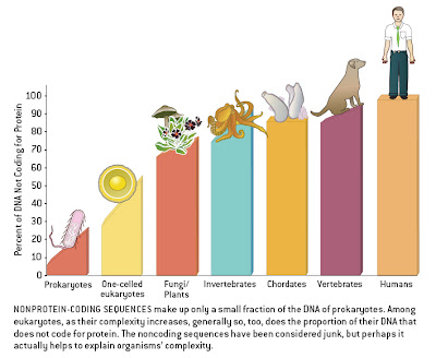
Larry Moran has provided a good discussion of complexity and genome size, and of the confusions that surround their relationship — rather, their lack of a relationship — to one another [Genome size, complexity, and the C-value paradox]. He links to my earlier story about figures that provide a misleading suggestion of a link between complexity and genome size, and in the process he tops the figure I mentioned [What’s wrong with this figure? see also Genome size and gene number]. In fact, the one he notes is easily the worst one I have ever seen like this, for all kinds of reasons. It is from a 2004 article in Scientific American by John Mattick entitled The hidden genetic program of complex organisms.
 Where does one begin? For one thing, humans are vertebrates and vertebrates are chordates, so this is just downright ridiculous. “Invertebrates” is paraphyletic as echinoderms are more closely allied to vertebrates than to other non-vertebrate animals. Some fungi are single-celled, and some people consider unicellular algae to be plants. The X-axis in these figures is never labeled, but the obvious implication is that it represents an increasing scale of “complexity”. It is probably unlabeled because otherwise one would have to provide units of complexity, and I doubt that would be straightforward at all. It certainly would be a challenge to justify ranking humans as more complex than dogs — I can not think of any way that one could defend such a position objectively. The sloping of the bars within taxa suggests that this is meant to imply a relationship between genome size and complexity within groups as well, with the largest genomes (i.e., the most non-coding DNA) found in the most complex organisms. This would negate the goal of placing humans at the extreme, as our genome is average for a mammal and at the lower end of the vertebrate spectrum (some salamanders have 20x more DNA than humans). Indeed, the human datum would accurately be placed roughly below the dog’s ass in this figure if it included a proper sampling of diversity.
__________
Updates:
- An astute, anonymous, commenter has pointed out a further distortion, namely that the disparate heights of the various organisms causes the eye to artificially exaggerate the differences among the bars.
- This figure has led to the coining of a new term .

My eyes hurt, and I’m just a science copy editor. I’d expect that kind of sloppiness from Time or Newsweek, but Scientific American really should have known better.
Just have to brag a bit…For the record, I was ranting ‘n raving about this one, in the face opposition no less, almost three years ago right after it came out:
See:
http://www.iidb.org/vbb/archive/index.php/t-104752.html
(as “Nic Tamzek” on IIDB)
Better link:
http://www.iidb.org/vbb/showthread.php?t=104752
…or…
http://www.iidb.org/
vbb/showthread.php?t=104752
…if it gets cut off.
Plenty of room for ranting about this one!
I once noticed a Michael Shermer column in Scientific American in which neither Shermer nor the editor caught the distinction between “fisson” and “fusion”. Now I have a graphical absurdity to go along with my textual one!
Yeah, but you could claim “typo” on that one perhaps… this is definitely a reflection of Mattick’s view, which appears in the primary literature in slightly less atrocious form.
Too bad this was published in 2004, it’s missing the chimp genome… as everyone knows, chimps are a hairsbreadth more complex than humans, right?
Or maybe humans can always be declared the most complex because of culture. Oh wait, dogs require humans and culture to exist. Dogs are the most complex organism!
The figure is even more misleading when you consider the height of the cartoons sitting on top of the bars. The human is very tall, the eye draws a line from the top of the chordate to the head of the dog and finally to the top of the human’s head. This perceived line is much steeper than the bars alone. Looking closely at the bars from invertebrate to human the difference in percent DNA coding is actually very small between these groups. Whether intentional or not, the cartoons placed in this graph really fool the mind into drawing larger differences than the graph would otherwise show.